Stop Right There–Read This Before
You Hit “Send” On Your Next Email Promotion!
I don’t know about YOU, but I’ve been inundated with a lot of holiday emails and promotions the past week. Most of them are poorly done, and based on my experience, I guarantee they aren’t resulting in any sales or leads for the senders.
The problem is most people don’t really know what has been proven to WORK in terms of email marketing.
So if you haven’t yet sent yours, read this blog right now!
If you’re already sent yours–don’t worry. Use these tips for your next email promotion.
What Doesn’t Work
- Lots of text
- Too many offers or promotions
- Too many images
- Too many links
- Too many columns, side bars, etc
- Too much stuff!
What Works
- A single promotion or offer
- One image that links to that offer
- Not a lot of text
Less is more!
Getting People To Click & Buy
I recently helped a very large Fortune 20 client (yep, in the top 20 of businesses in the world) with their email newsletters. My recommendation in summary: less is more. Within a month, their open rates, click through rates, and conversion rates improved by 400% simply by being…more simple.
I have hundreds of examples of this type of improvement from my clients (in all industries and ALL sizes of businesses), but I am not the only person who can give you these stats.
People get overwhelmed with the amount of emails they receive, and they tend to ignore anything that isn’t crystal clear with its message.
Disclaimer--Ok, yes, sometimes an email with a lot of text or multiple offers can work well, but it really depends on the type of message and the audience. You also really have to know what you are doing in terms of send-times and messaging.
In general, if you want to ensure good click-through and conversion rates, especially during the holidays, less is more.
Examples of Good Email Promotions
I’ve included 5 examples of really good email promotions–but aside from the first one, EVERY ONE could use additional optimization.
The reason I’m including these is because they most likely DID perform well, and by industry standards, they’re actually very good email promotions.
BUT with a few simple tweaks they could be even better. NOTE: none of these examples are clients of mine. First, my clients all have even better emails, and second, I usually don’t publish their details due to confidentiality. ;0
By explaining how I would tweak them, you’ll have a better understanding of how to create your next email promotion–and have it perform well!
Let’s take a look at what works, and why–and how to take it to the next level.
1. Great Email Promotion Example #1
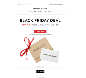
What’s Great About This Email Promotion
- Relevant messaging (Black Friday Deal)
- Not a lot of text
- Very clear offer–20% off a Gift Card
- Limited time promotion
- Very big and obvious button to shop
- One small and relevant image
- Encourages referrals!
This is a fabulous promotional email. I don’t have to wonder what it’s about…it’s obvious and clear. I love how it is a limited time offer–this helps create urgency to buy.
But the best part of this is that it encourages referrals, because it is a gift card promotion.
Well done, Pressed Juicery! I would not change a thing.
2. Great Email Promotion Example #2
What’s Great About This Email Promotion
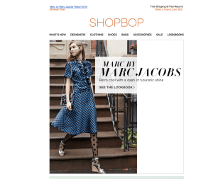
- A single theme/designer
- Not a lot of text
- Striking image
I like this newsletter, even though it’s not a sale offer, and there isn’t a big button telling me what to do (the text says, “See the Lookbook” but a colorful button would work better).
The reason I like this one, and it probably has a high click-through rate, is because it’s got one gorgeous image, and one “theme” around the Retro Cool of one designer. It’s simple and clear.
3. Great Email Promotion Example #3
What’s Great About This Email Promotion
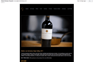
- Amazing product shot
- Not a lot of text
- Clear shop call-to-action
This is a great email promotion, and the main reason is due to the product shot. Now, I’m biased since I love this wine. 😉
The email most likely performed well, but, this one too could use some improvement. I would have made the call to action a big button in a pretty color, that says “Shop Now.” I also would have given it some sort of obvious discount or special–the text is too small to really see the offer on a case discount.
4. Great Email Promotion Example #4
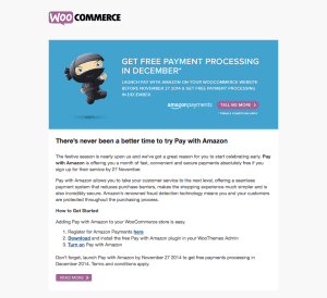
What’s Great About This Email Promotion
- Relevant messaging (Free payment processing in December–woohoo!)
- Limited time promotion
- Very big and obvious button to shop at the top
- Nice and different email template
I like this email a lot, and I liked the header at the top. It looked different and got my attention. The purple button at the top (and bottom) were clear–I knew where to click.
As much as I love this email promotion, it has way too much text. When you’ve got this much text–the best thing is to link to a blog or a page on your site. I know that some promotions, such as this one, have a lot of complicated terms and conditions–but the place to write all of that is NOT YOUR EMAIL. The email has one purpose–get someone to click into your offer. It is not the place to explain every last detail.
That said, I bet this email performed nicely–because of the excellent headline and top section.
5. Great Email Promotion Example #5
What’s Great About This Email Promotion
- GREAT template!
- Not a lot of text
- Striking image
- Crystal clear discount
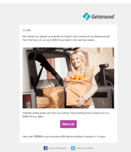
I like this email promotion. It’s concise and clear, and it doesn’t contain a lot of different promotions or “convincing” copy.
I would use an email template like this to send to a past customer who hasn’t come back in a while (just change the text to be relevant), or, just like in this example–to send to someone who signed up or expressed interest in your services, but didn’t take the next step to buy.
Now You’re Ready To Send Your Email Promotion!
I hope these tips help you create your next email promotion–and you still have time to send your holiday emails. I would suggest sending them next Tuesday if you haven’t sent them already. In general, Tuesdays work well across all industries and audiences for a good sending-time. 🙂
